
In my group, I was responsible for using photoshop and making mock ups of the packaging and the promotional banners, etc. I used the images which we got from our photoshoot. For our photoshoot, we wanted the images to consist of the ingredients which would be put into our fragrance to reflect on our transparent and honest way of talking. We wanted the consumer to know exactly what they were putting on their skin. We split the photoshoot into 3 sections, as we wanted a seperate photo for each of the 3 fragrances. For each one we used fruit of different colours to represent the mood of each fragrance. For energy we used colours such as orange and red, for optimism, we used greens yellows and oranges, and for calm we used the colours purple and green.
Packaging Mock-ups
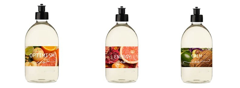
For the packaging, we wanted to keep the main bottle quite minimal, and use the photos from the photoshoot as the label and a pop of colour. So, I photoshopped the photos onto a plain bottle, and added some simple white font and our brands logo to the bottle.

For the diffuser, again we kept it simple to go with the natural theme and I added some simple line drawings of flowers to it to add more interest and added the CEO logo.
Inside packaging
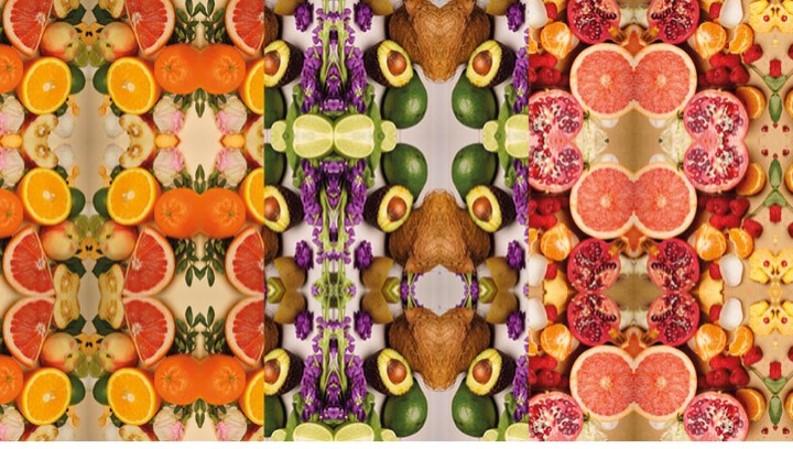
For this, we made a repeat pattern out of the photoshoot photos. The packaging for the bottle will be made out of a recyclable cardboard and will be plain on the outside, but once opened up, this bright repeat pattern will show.
Promotional Images


For these images, we used the pen tool on photoshop and drew around certain parts of the image to create an 80s style graphic look. We were inspired by 80s graphics for our promotional images and our logo as this would be the kind of time that the consumer would have been born [=, so it would catch their attention.
