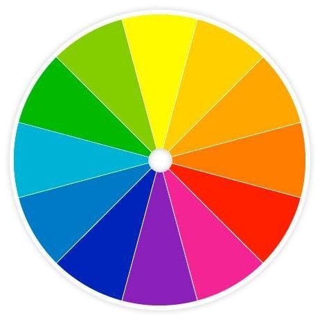
ORANGE

The colour orange is a very warm colour and has an energetic effect on people. For this reason this colour can commonly be used for sporting events. It is also a very fun and cheerful colour, so has been used for kids TV channels such as Nickelodeon. In marketing, the colour orange creates call to action (buy, sell & subscribe) and is also found in impulse shoppers, therefore it is used in logos such as Amazon and used in some shop windows to draw in impulse buyers. Finally, along withe the colours red and yellow, it has been known to stimulate appetite, so has been used for logos such as Hooters and Fanta.
YELLOW

The colour yellow is a very optimistic and happy colour, and is said to be the easiest colour to visualise. The colour yellow, like orange, is energetic and inspired people to keep moving therefore it is used for lots of reliable shipping companies such as UPS and DHL, which are renowned for speedy delivery. It is also one of the main colours which stimulates appetite and is used for food companies logos such as, subway and McDonald’s. Along with this, yellow is also a very creative and intellectual colour which promotes mental clarity and stimulates the decision making process, and is therefore used for brands such as BIC, and Post-it.
RED

Red is a very powerful and passionate colour which promotes a high level of urgency and energy. It is used for sale signs as its sense of urgency draws people in to buy things and makes them feel as though they need to buy something now otherwise it will sell out. As well as yellow, red also stimulates the appetite, and is used alongside the colour yellow for brands such as McDonald’s and Lay’s. It is also used for a lot of large stores which sell lots of cheap products such as K-Mart and Target, as again it stimulates people to buy more things.
GREEN

Green evokes the feeling of something being clean and fresh. These positive attributes make it perfect for the use of some food chains, such as subway (known for its freshly made sandwiches), and Tic-Tac, as they give you fresh breath. The colour green is also highly linked to health so is used for pharmacy’s and packaging for things such as plasters. It is highly associated with growth and wealth so is popular with premium lifestyle brands and financial firms e.g. Lloyds bank and Landrover. Green is known as a trustworthy colour, so is used for worldwide technology brands, such as Acer and Android. Finally, green is associated with nature so is used for many all natural food retailers such as Holland and Barrett and for the agricultural brand John Deere.
BLUE

Blue is quite an emotionless colour, however it is a very trustworthy and loyal colour so is often used for cleanliness products and personal care brands, such as Oral-B, Domestos and Dove, as it is important that these brands are reliable. Relating to trust and and honesty, the colour blue is often associated with interpersonal connections. It is therefore a popular choice for online and offline communication companies, such as Twitter and Facebook.
