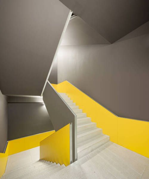
So in today’s Mac suite session, we started to look at visual contrast and how we could use this to make our work more interesting, especially when arranging images. We first started by choosing an image and then put it into Adobe colour wheel to create a colour scheme based on this image. This was my colour scheme that i had to work with:

After collecting colours from the photo and creating a colour scheme, i then went onto photoshop and played around with font size, different effects, distortion of the photo, messed with the scale etc, but all using the same colour scheme. These are the visual contrasts that i came up with.


